Amid India’s smartphone boom and the rise of large consumer internet companies such as Flipkart, Myntra and several others, profitability and funding rounds have dominated the narratives.
Designing these consumer products, creating engaging user interfaces hasn’t really made any big headlines, though.
Cleartrip, with its simple, uncluttered mobile web interface, has been an outlier on the design front. When most rival travel websites were busy packing their sites with innumerable features and deals, Cleartrip chose to doggedly keep its focus on a simple user interface when it launched in 2006.
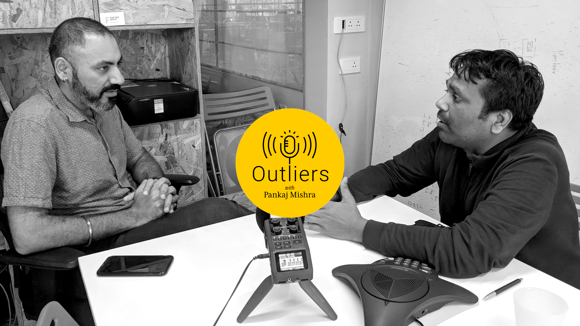
“We said, ‘Who is on mobile, and who are we designing for?’,” recalls Sunit Singh, design head of Cleartrip until August 2015.
“That helped us with a laser-focused design approach. In terms of the complexity of the interface, we cut it down to quite a extent.”
Singh adds: “That’s where I first learned the value of being laser-focused.”
So, how does a product balance ease of use and user convenience with this quenchless urge to pack more features than your rivals?
“You have to pick your battles. You can’t fight all of them. Designers have to pick their battles.”
Is Cleartrip indeed a greatly designed product or is it just that most of its rivals have shabbily designed products? How and why does Cleartrip continue to live on?
“I think about this question a lot myself. I would always tell my team that get to a level where there’s no other way to do it. There’s no better way to do it. I think that’s the secret,” says Singh.


